Colors

In this section, you can customize the theme’s color palettes. These will be used accross the site and will allow you to give a unique look to your store and make it fit your brand identity.
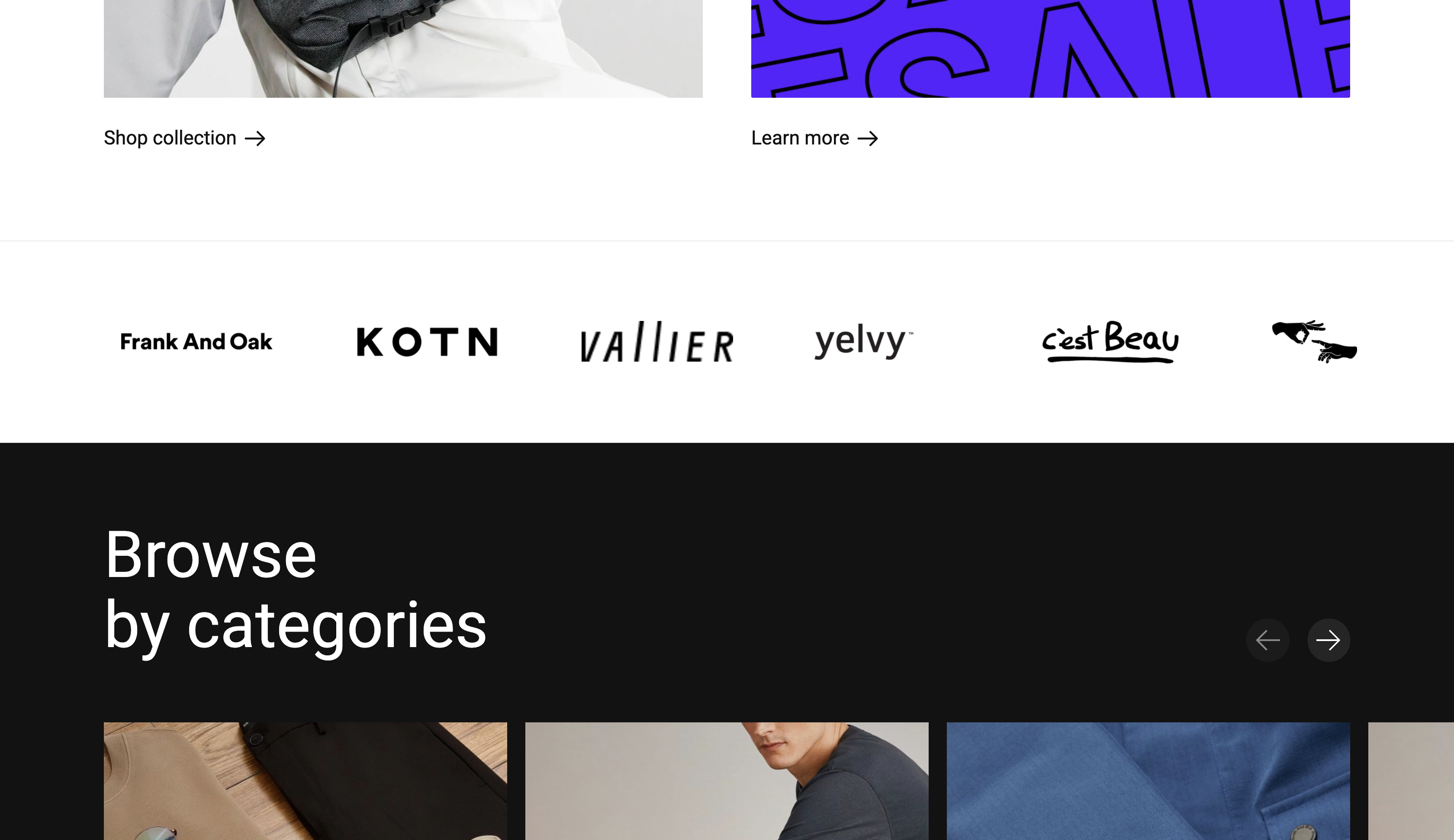
You can also create a “dark” color scheme that will be used to contrast some sections as seen in the image below. It’s called a dark color scheme but you can use any color you want in there.
⚠️ Pro tip: Make sure your text colors and background colors have enough contrast. This will ensure your texts are easily readable for all types of people and screens. A good tool to test this is https://coolors.co/contrast-checker/112a46-acc8e5.
Default color scheme
The main color scheme will be used widely throughout the website. In this example, the colors are:
| Text color | #121212 |
| Headline color | #121212 |
| Background color | #ffffff |
| Primary color | #5D00FF |
Subtle color scheme
The subtle color scheme will be generated automatically from the main color scheme and will simply add a subtle background color based on the default’s background color. There are no theme settings for this.
Dark color scheme
The dark color scheme is an additional color scheme you can create to contrast with other sections. In this example, the colors are:
| Text color | #ffffff |
| Headline color | #ffffff |
| Background color | #121212 |